Vanessa Guzzo Photography
When it comes to capturing the essence of your family through modern portraiture, a timeless look is key. One way to achieve authentic yet polished images is through intentional family portrait color schemes. With the right combination of colors, you can create art with your portraits.
In this post, we will explore a few color schemes that will give your photographs a stylish and captivating appeal. From classic neutrals to bold and vibrant hues, I hope this insight and inspiration helps you choose a color scheme that suits your family’s unique style.
Whether you’re looking for a cohesive color palette or prefer contrasting shades to highlight individual personalities, I’ve got you covered with expert tips to guide you through the process, helping you narrow down your options and ensure your family portrait showcases the unique connection and love that binds you all.
I can’t wait to help you find the perfect color scheme for your family’s eye-catching portraits!
Best Color Schemes for Family Portraits
Neutral Color Schemes for a Timeless Look
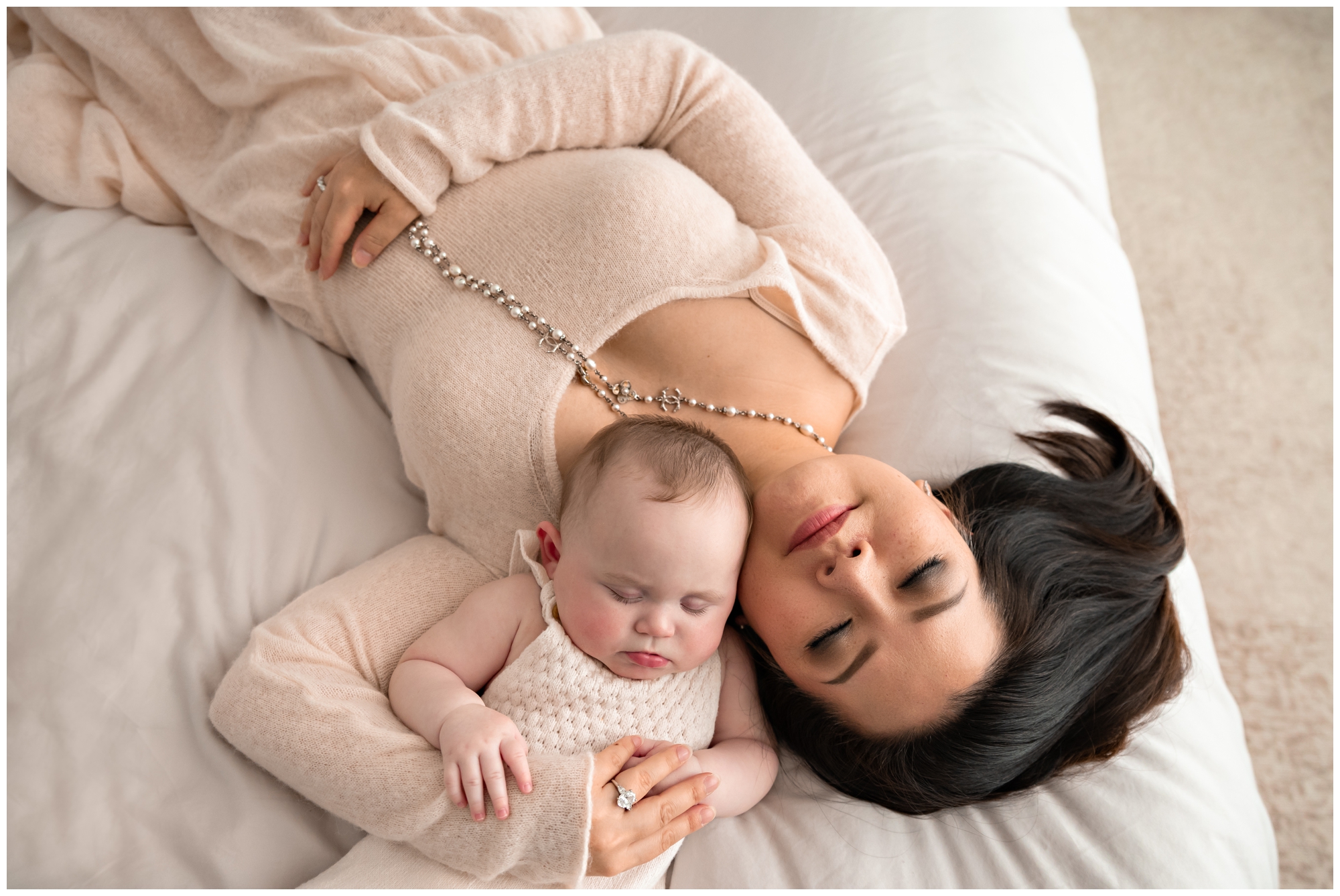
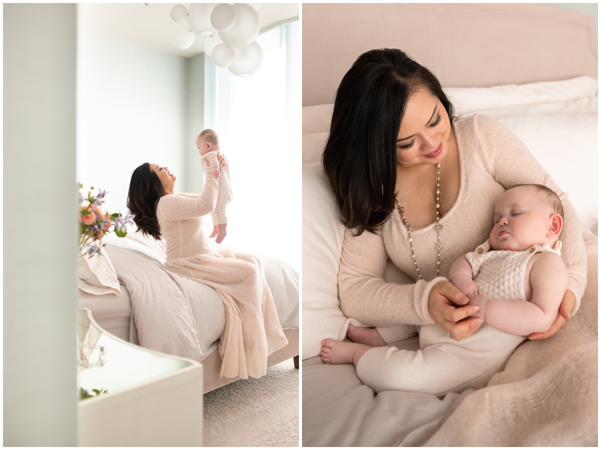
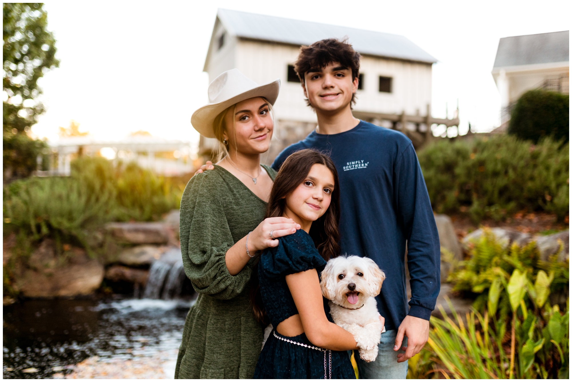
Do you envision a timeless, polished look? Refined family portraits start with a neutral color scheme. Neutrals are classic, elegant, and never go out of style. They provide a clean, sophisticated look that can easily adapt to any setting or background.
When working with neutrals, opt for shades like ivory, beige, taupe, or light gray. I especially love earth tones! These colors create a soft and timeless backdrop that allows your family’s personalities to shine through without overpowering the overall aesthetic of the image.
To add depth and dimension to your neutral color scheme, consider incorporating various textures and patterns. This can be achieved through clothing choices, such as pairing a chunky knit sweater with a flowy skirt or layering different fabrics like lace and linen.
A neutral color scheme doesn’t have to be boring! By adding subtle pops of color through accessories or incorporating metallic accents like gold or silver, you can elevate the overall look of your family portrait while still maintaining that timeless feel.
Monochromatic Color Schemes for a Modern & Fashionable Feel


For a modern, elevated style, consider a monochromatic color scheme by using different shades and tones of a single color to create a harmonious and cohesive feel.
Monochromatic color schemes are versatile and can be easily tailored to suit your family’s style and preferences. Whether you opt for a soft and muted palette or prefer bold and vibrant tones, the key is to choose colors that complement each other and create visual interest.
When selecting a color for your monochromatic scheme, start with a base color that suits your family’s skin tones and the overall mood you want to convey. From there, explore different shades within that color family to create depth and variation.
To prevent your monochromatic color scheme from appearing flat or one-dimensional, incorporate different textures and patterns. Mix up the clothing choices, accessories, or even the location of your photoshoot. Some backdrops work better with certain palettes.
Less is more when it comes to monochromatic color schemes. Stick to two or three shades within the same color family to maintain a sophisticated and cohesive look.
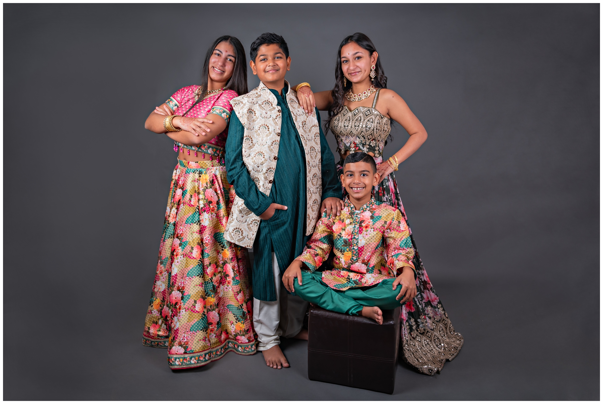
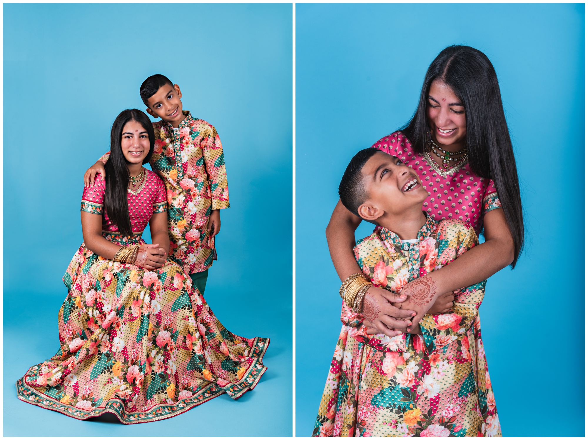
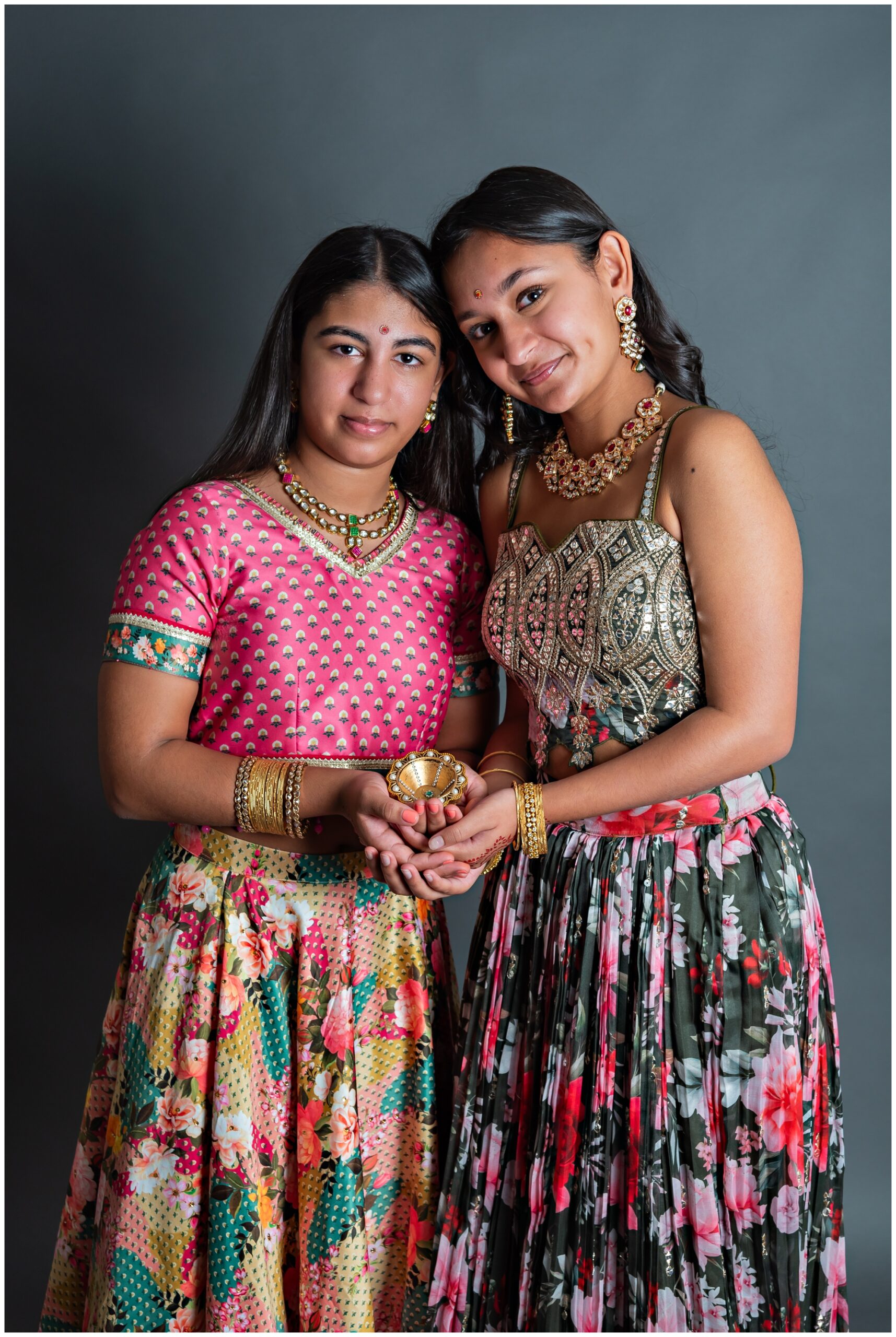
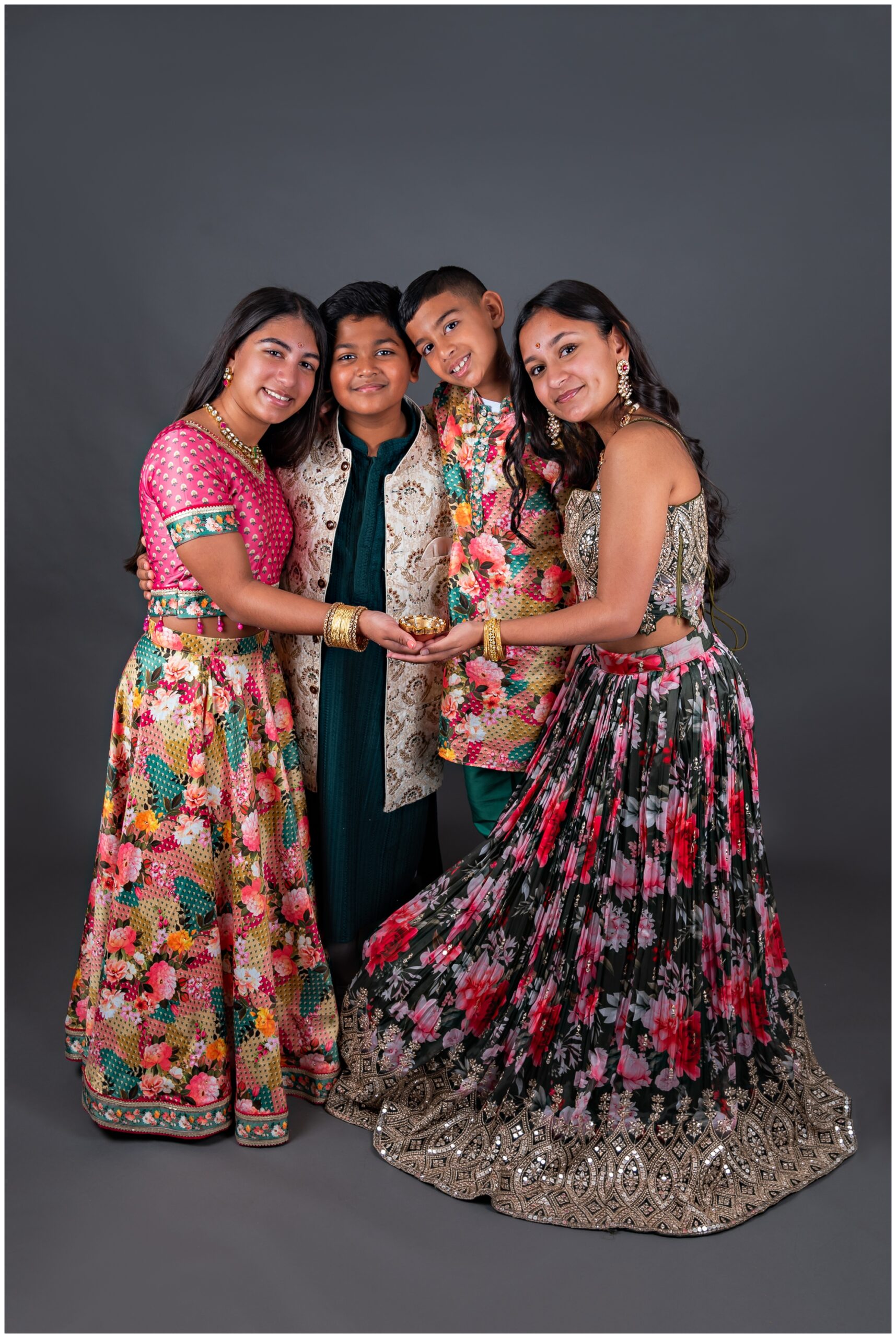
Complementary Color Schemes for a Vibrant & Balanced Look
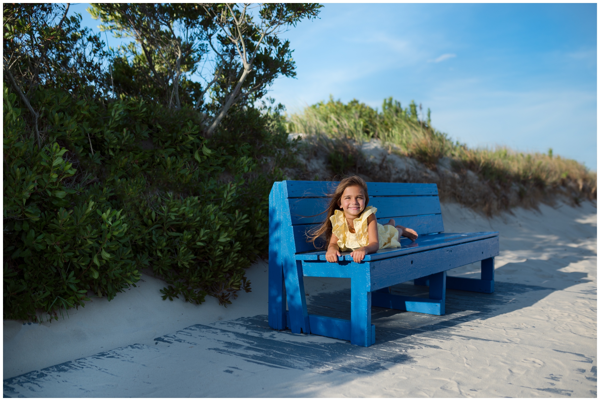
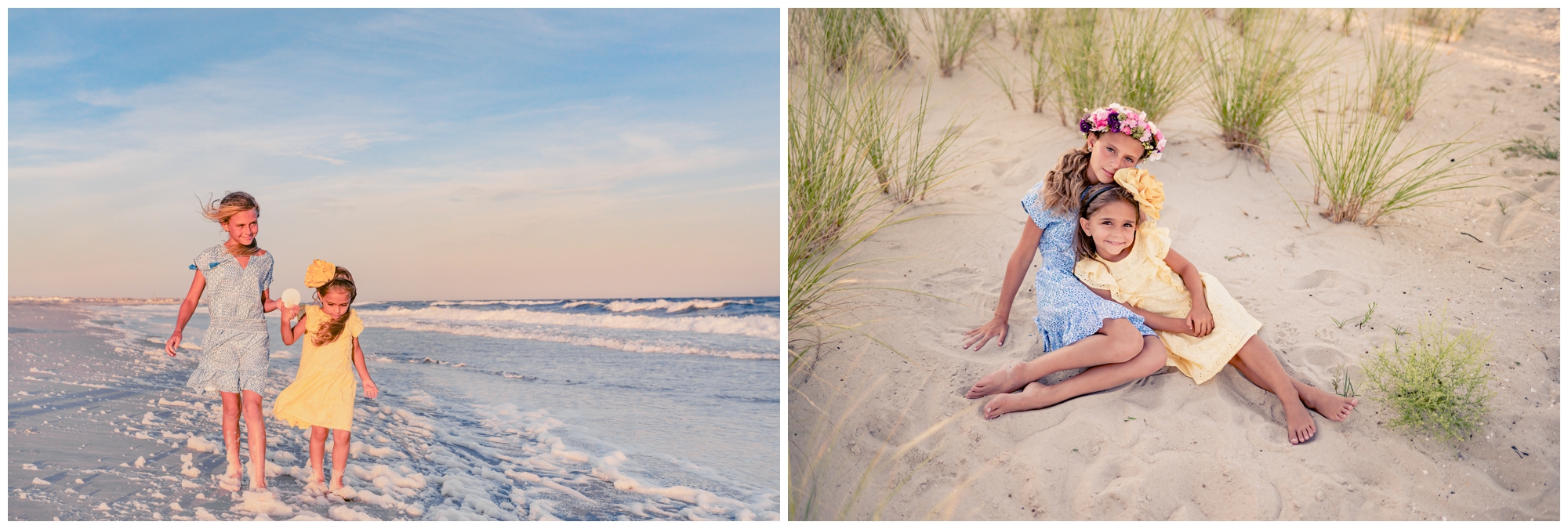
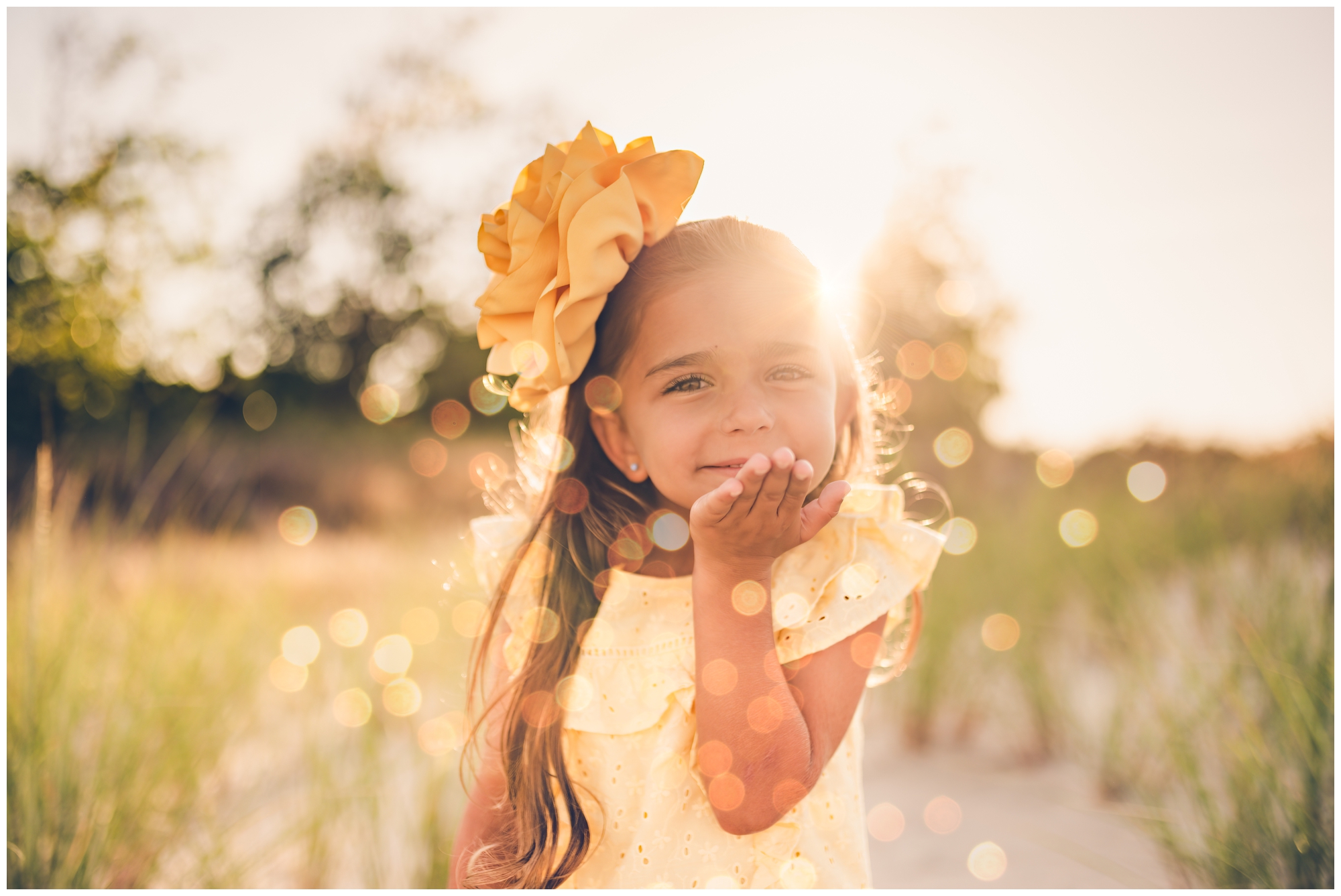
If you’re looking to add a pop of energetic vibrancy to your family portraits, a complementary color scheme is the way to go. Complementary colors are those that are directly opposite each other on the color wheel, such as blue and yellow, or teal and pink.
When using a complementary color scheme, it’s important to strike the right balance. Too much of one color can overwhelm the image, while too little can make the colors appear disjointed.
To achieve a balanced look, consider using one color as the dominant shade and the other as an accent. For example, if you choose blue as the dominant color, incorporate pops of orange throughout the image to create visual interest and harmony.
When selecting clothing for a complementary color scheme, it’s important to consider the skin tones of your family members. Some colors may be more flattering on certain individuals, so be mindful of this when making your choices.
A complementary color scheme should enhance your family’s natural beauty and personality, so don’t be afraid to experiment and have fun with it!
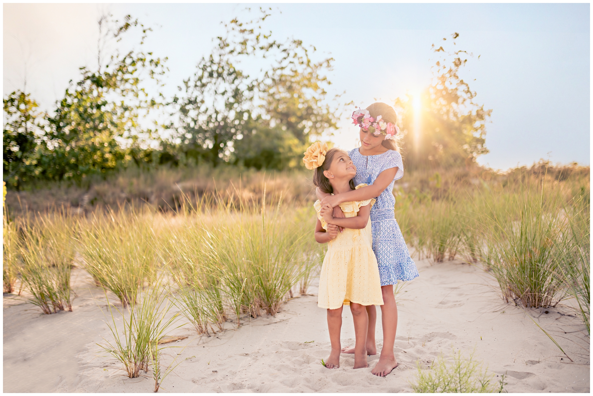
Analogous Color Schemes for a Harmonious & Cohesive feel
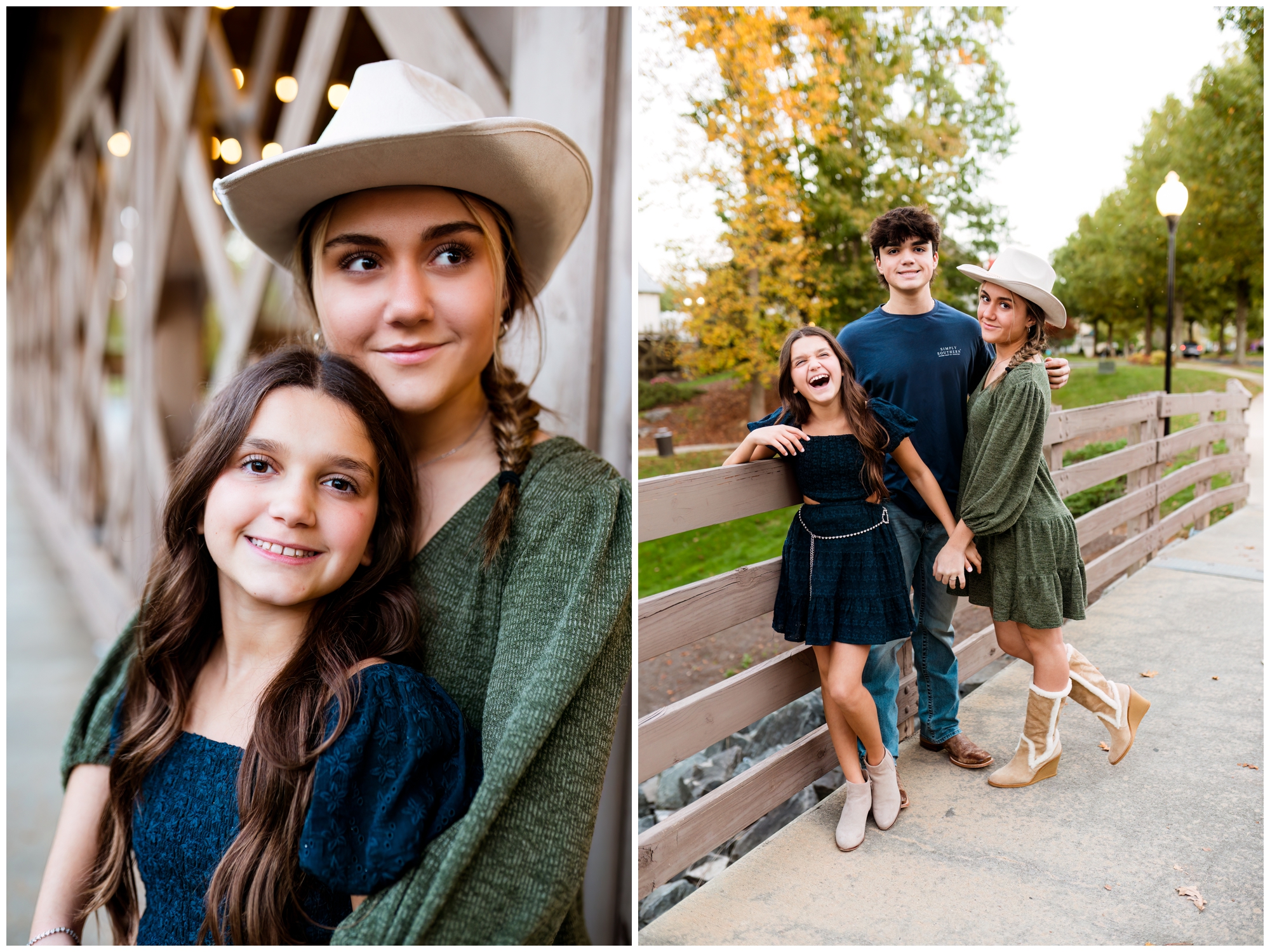
For subtly colorful family portraits, consider an analogous color scheme. Analogous colors are those that are adjacent to each other on the color wheel, such as blue, green, and teal.
Analogous color schemes create a sense of unity and flow, making them ideal for capturing the close bonds within your family.
When using an analogous color scheme, start with a dominant color and then incorporate shades from the neighboring hues to create a visually pleasing and balanced image.
As with the other color schemes, incorporating textures and patterns will add visual interest and keep you all from blending together.
Tips for Selecting the Right Color Scheme for Your Family Portraits
1. Consider the Location: You want your portraits to look cohesive without blending in or clashing with your background.
2. Complement Skin Tones: Consider your family members’ complexions and choose colors that flatter their individual features.
3. Reflect Your Family’s Personality: Consider each family member’s preferences, and choose colors that make them feel comfortable and confident.
4. Coordinate, Don’t Match: While coordinating colors is important, avoid going for an overly matchy-matchy look when considering family portrait color schemes. Instead, aim for a cohesive color palette that allows each family member to express their individual style.
5. Consult Your Photographer: If you’re unsure about which color scheme to choose, don’t hesitate to reach out! I’m here to guide you in selecting the perfect colors for your family portraits.
Color Schemes for Modern Family Portraiture
Modern family portraiture is an investment in priceless family memories. Choosing the right family portrait color schemes can ensure that you’ll love them forever. Each color scheme has its own unique appeal and can help you achieve the desired look and feel for your family portraits, and I hope this post helps you narrow down your options and select a theme that showcases your family’s personality and stands the test of time.